
PRESTIGE group kicked off with an Animal Feed Milling Plant and then ventured into Soybean Processing Solvent Extraction Plant in 1980-81. Since that glorious period, they have now upsurged into diversified areas to rise and shine as an agribusiness conglomerate. So, it was a now a calling to create a visual identity of this renowned brand which is exceptionally time-honored.
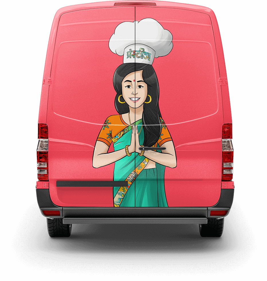
We approached Prestige to fulfill this purpose by creating a mother-cum-genie mascot which was homelike and instantly recognizable. The concept was not solely dedicated to emitting the essence of motherly love but for also the magic that every mother-figure possesses for the art of cooking.
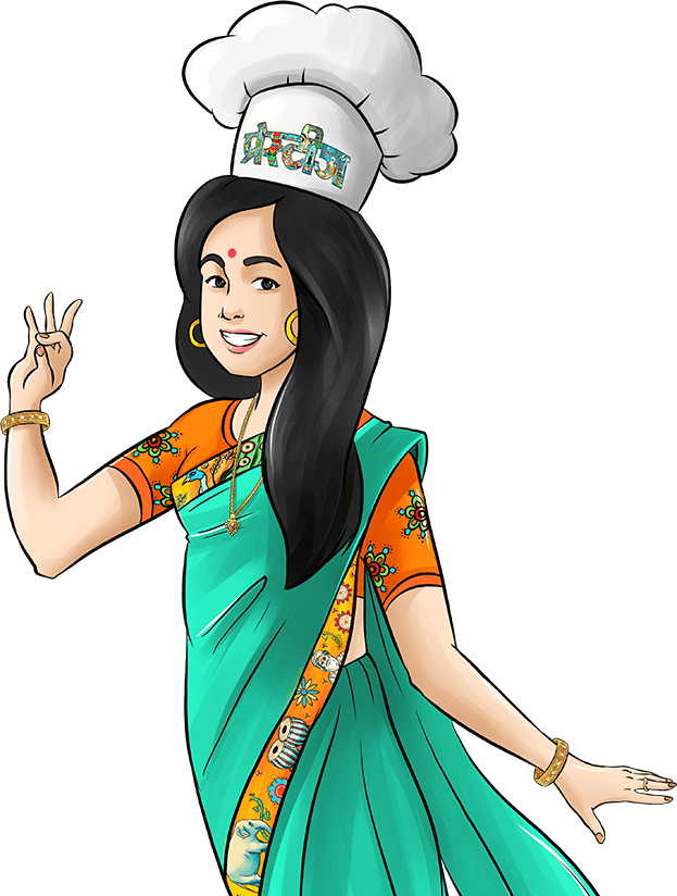
Prestige "Mother Genie" ensemble was intended keeping in mind the elements of their brand logo and a motherly figure in her 30's.
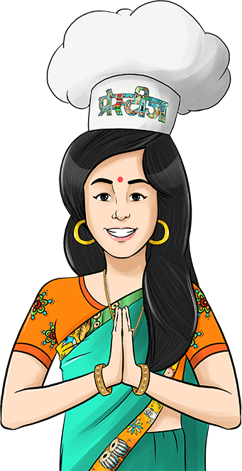
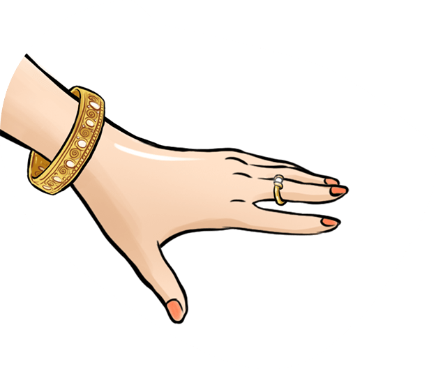
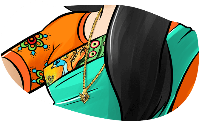
Mother Genie dons a simple plain saree which is adorned by a vibrant border. The saree was chosen to give the mascot more of a homely look. The border comprises of all the elements the brand logo bears. The mascot is also retouched with a simple set of jewelry.


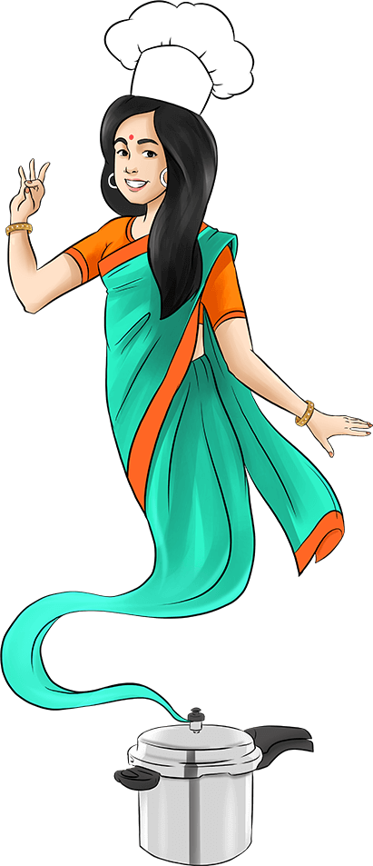
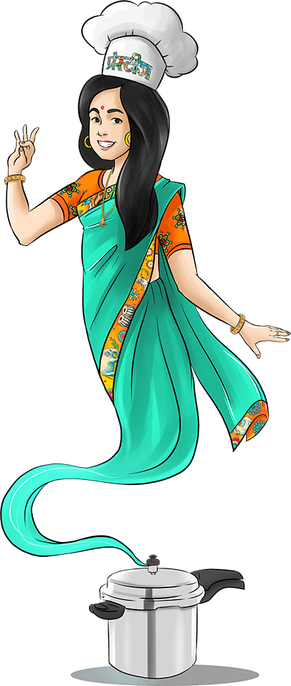

The chef's hat symbolizes the mother's expertise in cooking which needs no sort of degree. The genie protruding from the cooker and other dishes symbolizes the delightful fragrance and the taste of the cooked food. The purpose of Mother Genie is to help you master the art of cooking by genius home remedies and some handy tips and tricks.

Project Name Prestige Mascot Mother Genie
The idea was to design a delightful brand presence to turn the potential customers into the loyal ones. Our mascot doesn't only build the trust in the brand, but it also interacts with the potential customers to make the brand look more prominent.